Brand & product design

Two halves of the same design practice.

Design led in-house by Tawanda, shipped alongside every build. Product UI/UX where there's a real product surface — flows, states, interaction; brand and marketing design where the job is to make a new idea legible in ten seconds.

01 — Product UI / UX

Designing the product itself.

Mobile product · UI/UX01
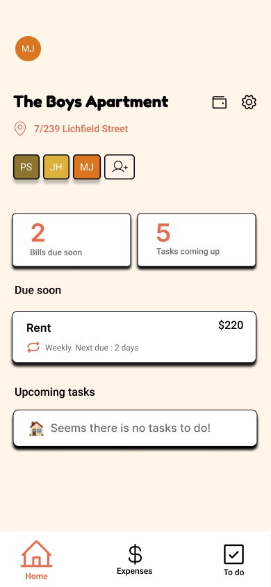
Flatly design screenshot
Mobile UXFlows & statesComponent library

Flatly

Brief

Household finance apps feel like tax software. Flatly is for flatmates in their twenties — split bills, share tasks, settle up without a spreadsheet.

Approach

Mapped the core flows first: onboarding a household, adding a bill, logging an expense, settling up. Home screen answers 'what do I owe and what do I have to do' in one glance; every other screen is one tap from there. Designed empty, loading, error and 'you're all square' states before any hero screen.

System

Native-feel components — sheet-based add flows, chunky primary CTA docked to the thumb zone, oversized status chips for bills-due. Warm off-white canvas (never grey), 20px card radii, per-housemate avatar chips in muted olive, mustard and burnt-orange.

What we shipped

Home, bills, tasks, expenses, settle-up and household setup flows — designed as a coherent product with a shared component library, spacing scale and interaction patterns.
Internal tool · Data UX02
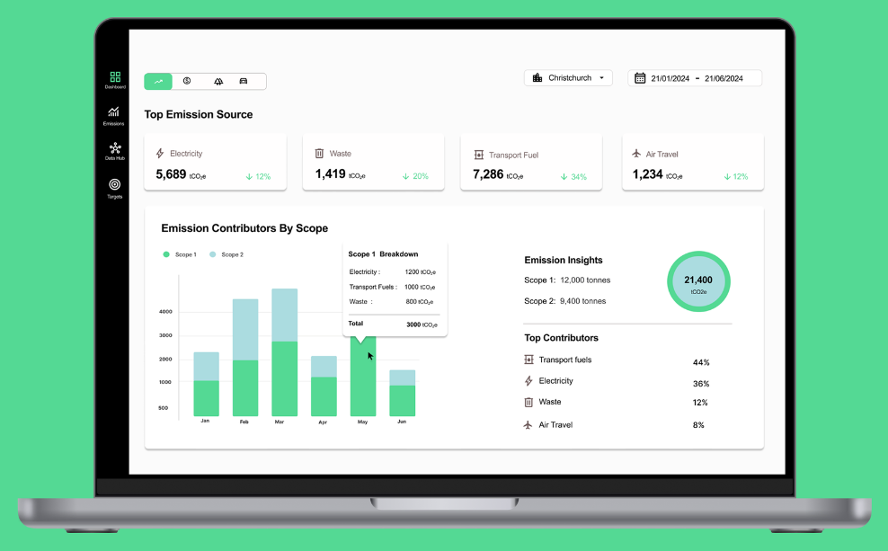
Carbon Analytics design screenshot
Dashboard UXData vizInformation architecture

Carbon Analytics

Brief

A sustainability team was writing the same monthly report from scratch every cycle. They needed a live analyst surface — filterable, drill-downable, shareable — not another PDF.

Approach

Sat with the analyst, watched them build the report, catalogued every question they asked the data. Promoted the top three drill-downs to hover states on the main chart. Chose stacked bar over line for scope contribution because the story is composition, not trend. Left rail keeps Dashboard, Data Hub and Targets one click apart.

System

Green as the single semantic accent (Scope 1 deep, Scope 2 light). Neutral surface, compact density, tabular numerals on every figure. Shared table, filter bar, KPI card and chart tooltip components across all three modules.

What we shipped

Emissions dashboard plus the shared shell that the Data Hub and Targets modules now sit inside — one interaction language across the internal tool.

02 — Brand & marketing design

Making a new idea legible.

Brand · Marketing site01
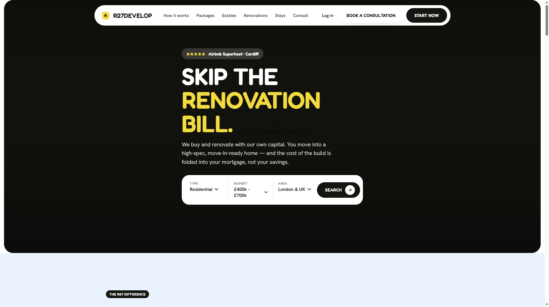
R27 Develop design screenshot
BrandMarketing siteDesign system

R27 Develop

Brief

R27 sells a novel financial model — buy renovated, fold the build cost into the mortgage. The site had to explain it before a visitor scrolled twice.

Approach

Lead with the value verb (SKIP) as the hook, put a live search bar in the hero as the primary CTA, float the pill nav so the brand stays present as visitors scroll. Dark canvas with one saturated yellow — confident without slick.

System

Heavy grotesk display over a neutral sans body. Near-black canvas, R27 yellow as the single accent, white ink. Reusable marketing components: pill nav, search bar, filter selects, package and estate cards.

What we shipped

Brand direction, marketing site and consultation flow, plus a component set that extends cleanly to estates, packages and renovation pages as inventory grows.

Brand · Marketing site02
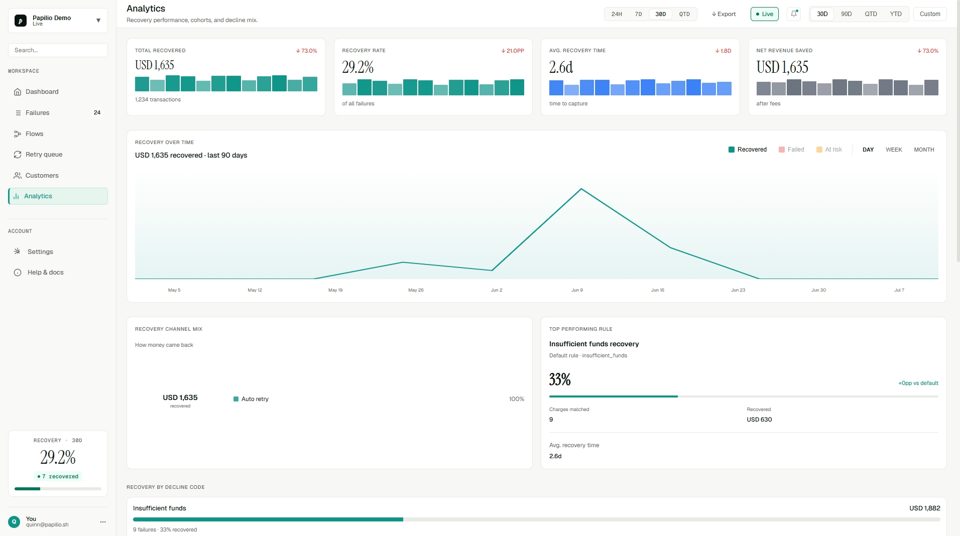
Papilio design screenshot
BrandMarketing siteVisual language

Papilio

Brief

Papilio needed a marketing surface that made a subscription-recovery product feel considered — merchants had to trust the numbers before they'd trust the pitch.

Approach

Editorial hero with a real dashboard preview above the fold — the product does the selling, the copy stays out of the way. Feature sections built as scannable pairs (claim + proof panel) rather than a wall of icons.

System

Serif numerals for weight on figures, restrained neutral palette, one teal accent tied to the 'recovered' state in-product so brand and product read as the same object. Reusable hero, feature, pricing and testimonial blocks.

What we shipped

Marketing site, product screenshots and the visual language the in-product dashboard inherits — brand and product designed as one system.

Cross-link

See the engineering behind these designs.

View Work

Have a project in mind?

Let's build the right thing, quickly.

Book a call